

Creating a color palette for your home encompasses more than wall paint colors. A good color scheme also takes into consideration your furniture, flooring, fixtures and accessories. The following are some of the concepts designers employ to craft many color details into a pleasing big picture.
Finding Your Neutral Color
Neutral colors are considered the backbone of a color scheme. Technically, neutral means having no strong characteristics or features; for colors that traditionally means white, tan or grey. For your home’s palette, a neutral is something that simply looks great with any other colors you choose. Take a look at this palette of colors that do just that:
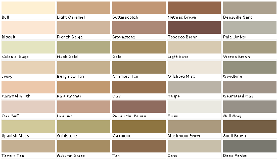
We see shades of green and warm browns, yet these are considered neutrals. In the case of green, it is certainly Mother Nature’s neutral, acting as a backdrop for every color imaginable, and can you think of a color that clashes with an emerald green lawn?
When most any color can be classified as neutral, you need a way to narrow the choice, and here’s the secret to doing that: designers help you pick a color that will serve as the large backdrop for all other colors. If that becomes a decidedly lavender or golden color, and it’s the perfect backdrop for your space, then it is your neutral color.
Wall Color Is Your Last Consideration
It is easier to find wall colors that coordinate with existing furniture, accessories and fixtures than it is to bend these things to the will of a can of paint. Especially in places like kitchens or bathrooms with a majority of fixed objects like countertops, cabinets and tile, it’s best to cement the colors of those big ticket items and then work the color of an inexpensive can of paint around them. Designers often wait until the very end to create a custom color inspired by what’s already in the room, so let wall color be the least of your color palette worries.
Consistency Without Boredom
One color theme throughout the home can be dull, while every room being drastically different can feel like a carnival. The designer trick is to find one or two consistent elements that carry through the entire home so you are free to play with a multitude of colors.
For example, you have a good baseline when all trims, molding and doors on one level of your home are the same color. Or you can use several different hues and shades of one color as the common element in each room. You create ease and comfort when the eye can subconsciously register these types of consistent patterns.
The one deviation on this plan is to treat different levels of your home as separate entities. The ground level of a home tends to be more public than an upstairs private realm or the retreat of a basement. Just keep in mind the stairs and landings that transition to a new level, and once those are cleared, you are free to start over with a whole new color palette.
Ignore Color Rules & Myths
You’ve heard them before… light colors make a room look larger, dark colors make a room look small, pastels are feminine, bold colors are masculine, etc.
A room should reflect your personality and create the mood you desire, so designers concentrate on how and when you use a room to come up with a unique color palette, regardless of color rules and myths. For instance, your bedroom is a private place about comfort and rest. If a dark, rich color palette will enhance your sleep and sense of well-being, then the deep colors do not make the room look smaller but more intimate!
The quality of light – natural and installed – in a space affects color choices, as does how you want the room to feel. If a chartreuse sofa and an eggplant area rug in a predominately white living room make your heart sing every time you walk into it, then that’s the rule to follow.
For help with creating a color palette for your Metro St. Louis home, work with the certified designers at Mosby Building Arts. To begin exploring color, call the Mosby office at 314.909.1800 or contact theme here.