


Mosby Building Arts Designer, Laura Powderly, sees life as a big box of crayons, and imparts that joy of color to her remodeling clients. Laura shares some of her thoughts about the colors that surround us.
Color directly affects the senses and this scientific fact is used to guide us through public spaces. Have you ever noticed that doctor offices tend to be in shades of pale green, blue and gray? This is because those are calming colors which can help you relax in a potentially nervous place. In contrast, colors like orange and red are more energizing and can – as Hans und Franz say “Pump you up!” – so they are used in fast food restaurants to stimulate appetite and get you out the door quicker.
When it comes to the privacy of your home, it’s important to understand how color may affect your moods and how to use it for remodeling projects.
Therapeutic Effects of Color
Warm colors are stimulating while cool colors have a calming effect. With this in mind, kitchens are perfect for lively warm colors like butter yellow and tomato red, while bedrooms are for sleeping so benefit from cool colors like deep blue and sage green. You can achieve this with wall paint, furniture or accessories in these colors.
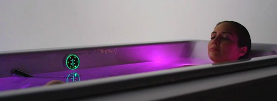
Or you can soak in the color. Kohler understands the power of color and offers tubs with chronotherapy features. This technology uses color to either energize or create a state of rest both physically and psychologically. Small lights are placed around the bathtub to create a sequence of colors, letting you isolate one color that is perfect for your mood that day.
Tricks and Tips to Finding the Right Paint Colors
Picking out paint colors that make you comfortable in your home can be a daunting task. If it seems like designers can do this with ease, it’s because we know these facts about selecting colors:
Lighting: Light is a major factor when looking at paint colors. Under the two most common types of lighting – incandescent and fluorescent – the same color will give off a different hue. Incandescent lighting has a more yellow glow to it and can make a beige color look yellow. A florescent light, on the other hand, can make the same beige color look greener. And the hue can change again depending on how much natural light is in the room during daylight hours. The trick is to look at paint samples in the space you plan to paint, and if the remodeling project includes updating your light fixtures, make sure you’re looking at paint samples with the new lighting scheme.
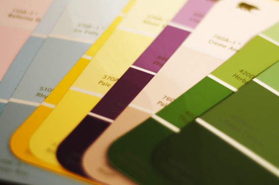
Hues: A quick glance at paint chips shows there are a ton of gray paint colors; however some grays are bluer, while others will have a green or red quality to them. That difference in the shade of gray is known as hue. Knowing which hue a color is comes into play when pairing a neutral, such as a gray, with other colors in your home. For example, if you are painting the dining room blue and the adjoining kitchen gray, look for a gray that has a blue hue to it so it complements the dining room color. It’s also a good idea to have both warm and cool hues throughout the home to create a sense of harmony and balance.
Tones: If you really love a certain type of purple but are hesitant to put it on a wall, try a different tone of the color. A tone is the addition of black or white to the original pigment. When you can’t decide between two or three different colors, always look for the one with a better tone. This creates a softer color that holds the pigment while being more pleasing to your eye or lighting environment. When in doubt, go with the color that is more “grayed out.”
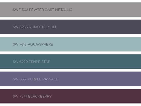
Let’s use what we’ve learned with these color swatches above, which are from Sherwin Williams’ forecast of the most inspiring colors for 2016. These are cool and calming colors that hue blue with softened gray tones of purples and teals. Any of these colors would work beautifully in a bedroom or master bathroom, or in spaces where concentration is important, like a study or home theater. I would obtain large swatches of these colors – or even better, a sample size bottle of the actual paint – to see how they look in the unique lighting situation in your home.
Color is an endlessly fascinating topic, and there’s always so much to learn. Choosing colors is a fun part of a remodeling project because we learn so much about our clients’ desires and aspirations. And finding your perfect color is a victory! If you’d like help choosing colors, give us Mosby designers a call at 314.909.1800 or contact us here.